2019-04-12
Signal Theory’s New Logo: Learning to Resonate with Change
By Joe Wilper, Associate Creative Director, Signal Theory
Working on new identities and branding for our clients is what gets us up in the morning. When you’re asked to rebrand your own company, well, that’s a project that keeps you up at night.
From a process standpoint, there’s no difference between the two. Emotionally, it’s a different story. You’re designing something that you and your colleagues will have to live with for the foreseeable future. You’re making a big change. And you want that change to be something meaningful for your company to rally around for years to come. Something that will inspire and instill pride.
No pressure.
When you kick off branding for a new client, your outside perspective can be one of your greatest tools. You immediately realize how much you use that tool when you’re faced with the reality that you don’t have it. In this case, all of us were insiders. There’s an adage that agencies are their own worst clients. We didn’t want that to be the case here.
On the other hand, being your own client, you are tempted to throw every bell and whistle and trend you can think of at a project like this, but it was important that we rein ourselves in. We wanted to keep things really tight and really simple.
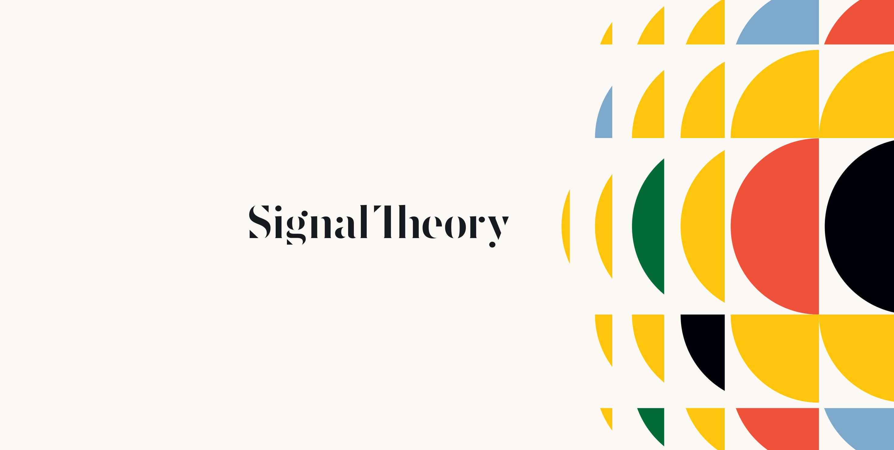
The Signal Theory logo was inspired by our new strategic framework -- the idea that we want to create resonance in the signals between people and brands. The challenge was finding a way to communicate that in a simple mark.
Look at the logo from a distance and you’ll see words. But look closer and you’ll notice a series of shapes. Your brain makes the necessary connections to form the words in your head. This is the gestalt principle of closure at work. Preferring complete shapes, we automatically fill in gaps between elements to perceive a complete image, the result being that we see the whole first. Our little shapes are literally a signal to the viewer’s brain.
The initial capital “S” is a nod to the academic work we did in and around the new framework. The Signal Theory logo balances the exacting world of academia with a vibrant and purposeful color palette.
Signal Theory colors are relevant to our focus areas of food and animal health and wellness. Green represents a leafy salad or the rolling pastures where cattle might roam. Blue evokes the water we drink and the sky under which everything lives. Red and yellow are our warmth – the sun that sustains us and fruit ripe for the picking.
I don’t mind telling you that creating our own logo was an emotional roller coaster ride for our team. In the end, though, this mark-and-color story resonated with us and it’s been fun to see it come to life in materials, cups, glasses, backpacks and, of course, client presentations.


