The Rebranded SONIC Drive-In Cup That Embraced Fans’ Love of Summer

SONIC Drive-in: Summer Packaging Rebrand

How a SONIC Drive-In packaging project became a tribute to fans and summer.

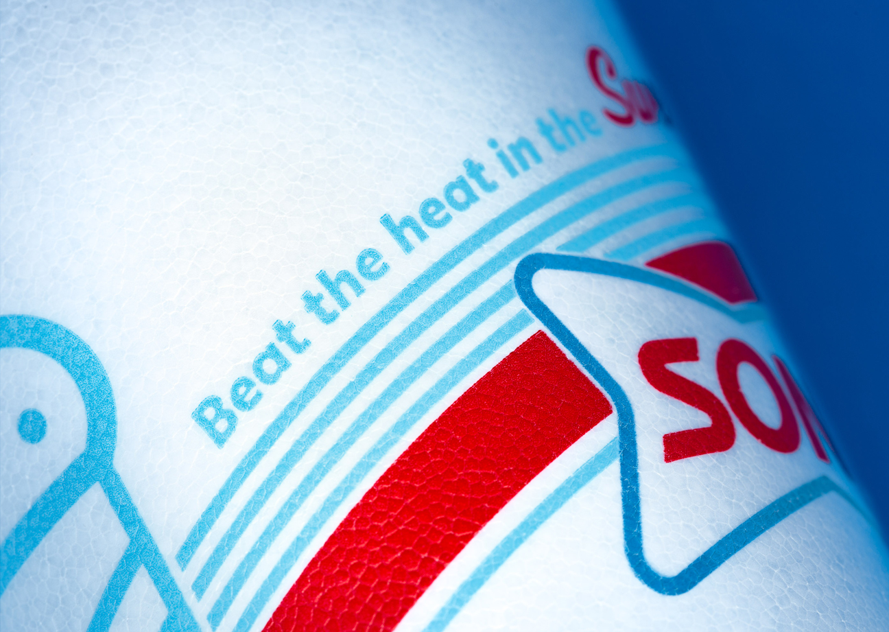
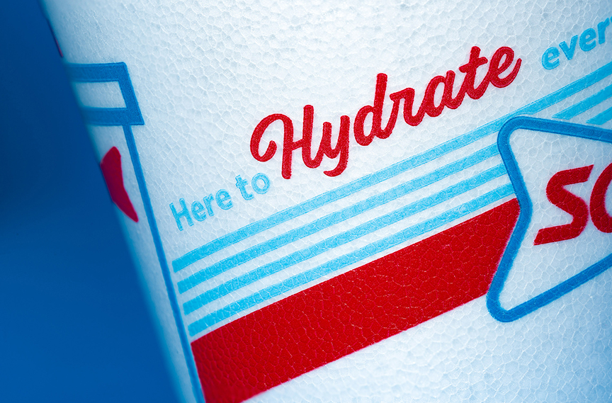
For SONIC Drive-In fans, the cup has become an iconic part of summer. They hold it like a badge of honor – and take selfies with it and post them to social media. So when we were tasked with rolling out SONIC’s new brand look on the full line of summer packaging, we knew we had to make a splash.

Sonic Drive-In Summer Cup Design Packaging Icons

Big icons. Bold stripes.


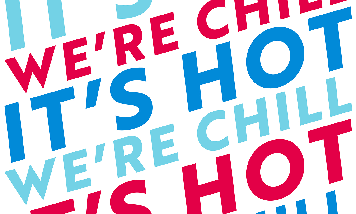
Visually, we went all in on the brand’s new bold stripes and icon set. Each cup and bag highlighted a different icon from SONIC’s new visual family and paired it with messaging that indulges guests’ inner need for a summer getaway.

Sonic Drive-In Summer Cup Design Packaging


“While introducing America to SONIC’s new look, our goal was to embrace our fan’s love of the brand and closely connect that to the joy of summer – a feeling that could potentially last all year.”


– Brent Davidson, group creative director

Sonic Drive-In Summer Cup Design Packaging
Sonic Drive-In Summer Cup Design Packaging Logo


Related Work